Thursday 19 December 2013
Contents Page Questionnaire
This is the questionnaire I have made for my contents page.
Click here to take survey
I will post the results and the changes I have made on the contents page due to the results soon.
Contents Page: Part 2
This is the finished version of my contents page so far.

- I have finished adding the story headlines to the contents page and the page numbers.
- I decreased the font size to make it smaller than I originally had it so I could fit more storylines on.
- I am now going to make a questionnaire asking my audience what they think of my contents page and how I can improve it.
Wednesday 18 December 2013
Contents Page
This is the contents page for my magazine so far.

- I have kept to the same font and colour scheme that was used on my cover to help create a house style throughout the magazine.
- I have included three photos, one that relates with the main story featured on my magazine cover and the others for another story.
- I have started listing the stories that will be featured in the magazine.
Next, I need to add page numbers and finish the contents
list off so people will know what is being featured in the magazine.
Monday 16 December 2013
Style Model: Contents Page
This is the style model I used for my contents page. It is
the contents page from ‘Q.’

I have used the same layout as this contents page including the photos, the title and the storylines. However, the colour theme I used is different to fit to my pop genre.
Sunday 15 December 2013
Thursday 12 December 2013
Tuesday 10 December 2013
Completed Front Cover
This is the final draft of my front cover.

Monday 9 December 2013
Front Cover Update

- I changed the background of the posters from white to grey, and then made the pink border slightly smaller as I thought it was too bold before.
Sunday 8 December 2013
Updated Front Cover
This is now the updated version of my cover with some of my
photos on. I used the Quick Selection Tool to delete the background of both the
main photo, and the photo that is used at the bottom as a poster. I made the
main photo fit the size of the front cover, with one of the models head
covering part of the title as typical convention of a magazine cover.

Now, I need to add the rest of the photos onto my cover, as
posters, similar to the one that is found at the bottom of the cover. I also
need to add the story headlines onto the cover and the strapline.
Saturday 7 December 2013
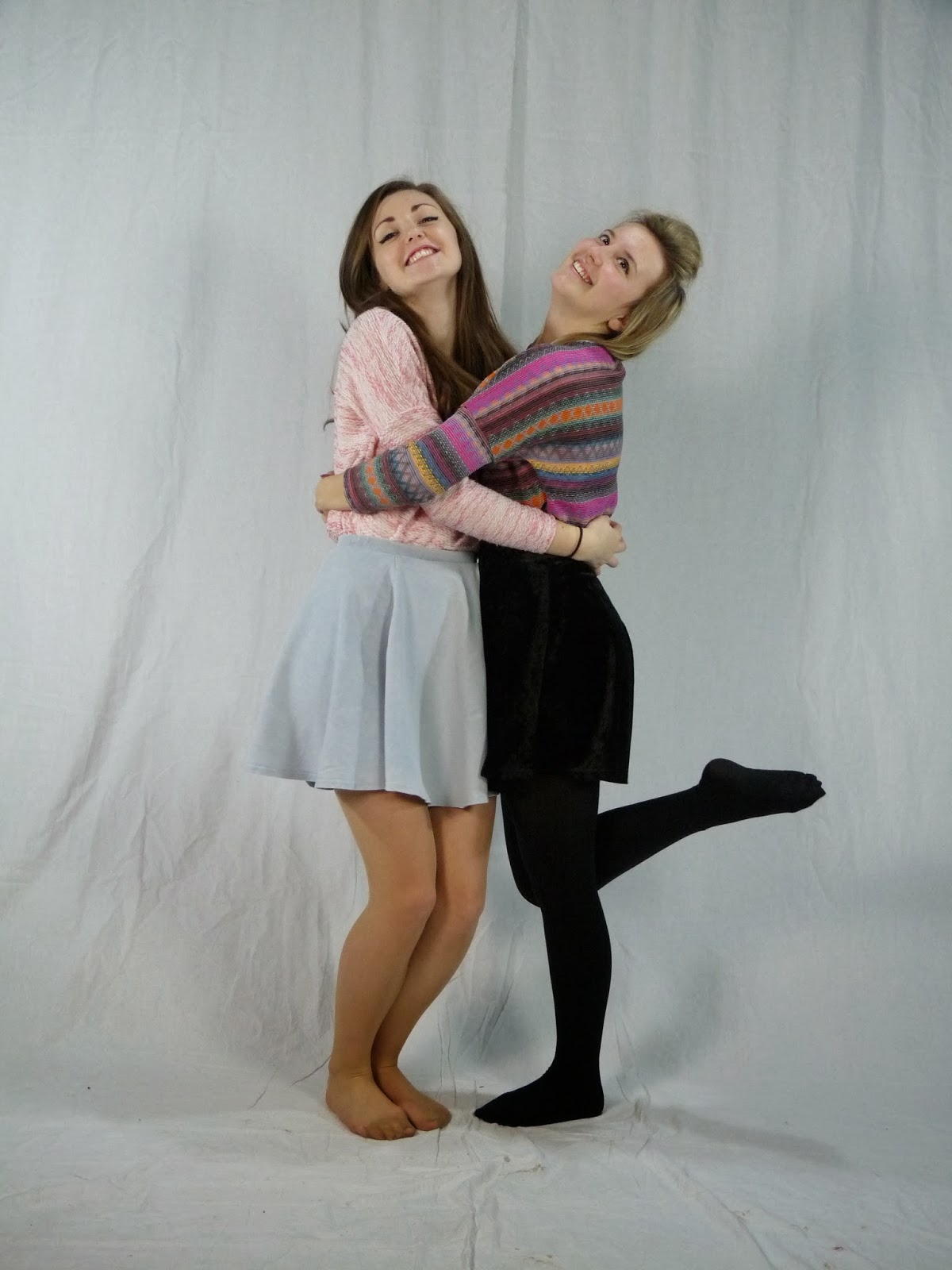
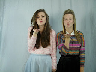
Editing Photos
At the moment I am busy editing the photos I am going to use in my magazine, especially my front cover photos as that is what I am working on at the minute.

This is the photo I started with.

I then used the Quick Selection Tool to delete the background of the photo. Afterwards I used the Mask Edge to bring back some of the edge around the hair of the girls so the photo didn't look so harsh. I also brightened the photo slightly as it is quite a dark photo.
This is the finished photo after all of the editing, before I put it onto my front cover.

Wednesday 4 December 2013
Sunday 1 December 2013
More Photos
This is a video I have made on Animoto including more of the
photos that will be included throughout my magazine.
Thursday 28 November 2013
Photos That Aren't Being Used
Out of all the photos I’ve took so far, these are the photos
that I won’t be using at all; either because they are blurry, the models aren’t
looking at the camera or they are moving rather than doing the right pose.


Monday 25 November 2013
My Photos
I have recently taken the photos that will be the main
feature of magazine’s cover and double-page spread. Here are a few of the photos
I have taken that may be the photos that I will use:


While taking my photos, there were a few problems that I had.
For example due to my models moving, some of my photos have turned out blurry. We, also, couldn't think of many poses for the girls to do, so it took a while to get a variety of different photos.
Also, I tried to take action shots of the girls jumping in the air, but I couldn’t
get the photo taken at the right time. As well as this, one of the lights we
were using was broken, so the light kept flickering, altering the lighting at
times and making it uneven.
Interactivity
Interactivity has become must more important for magazines
over the last few years. Interactivity is the way a magazine allows interaction
between the magazine and fans; the fans and artists and fans and other fans.
Most magazines now have websites, helping them to take
interactivity even further than they could without these websites due to the
fact they can offer technology that can’t be used for interactivity in
magazines.
There is a lot of new technology that help interactivity
such as being able to stream videos of interviews with artists or videos of
gigs; being able to have download links to music; having comment sections where
readers can talk to each other and allowing readers to submit their one reviews
easily by having a review page.
Another way that helps the magazine interact with the
readers is through social media websites. Websites such as Facebook, Twitter, and
Instagram is a simple way that magazines can interact with readers due to fact
readers can instantly reply to the magazine. Fans can post there gig photos and
videos instantly through the social media websites too, and tagging the
magazines name in the post allows any fan that search the magazines name to see
these posts too.
Social media is an excellent way to get the readers opinion
on the magazine. For example: the editor of Kerrang!,
James McMahon, tweeted asking fans about who they wanted to go on the cover of
their new music special. As well as this, he also invited demos from new bands
and applications from aspiring writers. This is a great example of how music
magazines keep their audience by engaging them, allowing the reader to feel
like they have a say in what happens.
Friday 22 November 2013
Thursday 21 November 2013
Naomi Wolf's Theory
In my magazine, I will be using photos of girls on my cover,
as well as double-page spread. They are represented as sexually attractive
women which attracts to my target audience of teenage girls because they want
to be like the attractive people on the magazine.
Naomi Wolf, the American feminist (1991) says that images of attractive women are used to help sell products to other women. She means that women have been conditioned into aspiring to be like what is fashionable now, by a male dominating society.
By using attractive women in my magazine I will be exploiting her theory that an attractive model is used to sell a product leading women to think if they buy the product, they will look like the model.
Second Draft Front Cover
This is now the next draft of the cover:
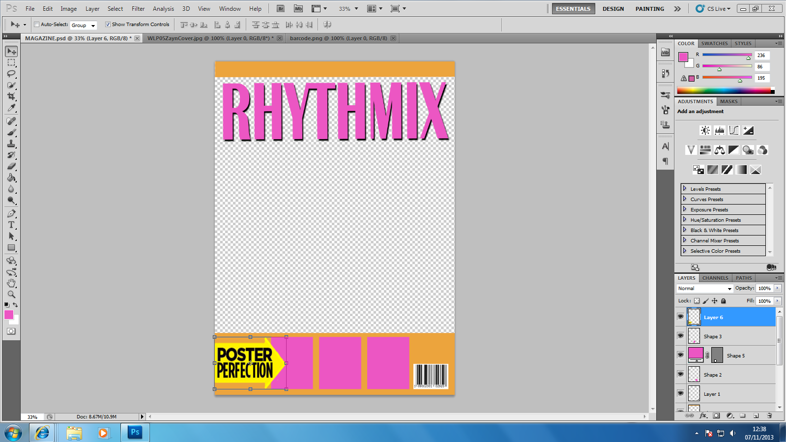

I changed the shade of pink used on the cover and decided to change the title to pink with a black outline as it stands out more than the original title of orange, outlined with pink, since more people from my questionnaire didn't think this stood out. I added a header, and footer of orange, to keep in with the colour scheme and added a yellow arrow with ‘POSTER PERFECTION’on it, which is often used in other pop magazines. I kept the layout of the magazine cover the same as my first draft so far because most people who answered my questionnaire liked this.
I finish my cover page and add my photos I will keep updating the progess.
Friday 15 November 2013
Front Cover Questionnaire Results
These are the results of the questionnaire that I handed out about the first draft of my magazine cover:
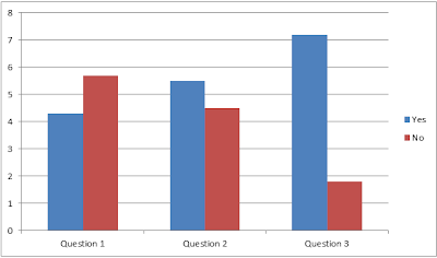

More people answered no to the first questions meaning they thought that my title didn’t stand out. For question 2, there wasn’t a great difference, but more people thought that the colours matched. For question 3, most people liked the way my cover was set out.
Tuesday 12 November 2013
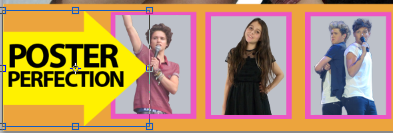
'Poster Perfection' Inspiration
After seeing this ‘We Love Pop’ magazine cover, I decided to
make a section on my front cover advertising free posters inside the magazine.
I used the same idea as ‘We Love Pop’ with the arrow pointing to the posters as
I think it can catch the reader’s eye.

First I used the shape tool in Photoshop to create an arrow,
I chose the colour yellow as it stands out from the colours I have used on my
cover so far, attracting the reader’s attention.
I then put a yellow square over the arrow to make it wider,
and then added ‘POSTER PERFECTION.’ I used the same phrase as I thought it was
catchy and fun.


I then added this to my cover, alongside three posters of
different artists and bands that I have took and added a pink border around
them to fit the house style of the magazine.
Monday 11 November 2013
Cover Questionnaire
I made another questionnaire talking about my front cover and am now going to hand it out to people of my target audience. This will allow me to know what people think of my front cover so far.


Thursday 7 November 2013
First Draft Magazine Cover
This was the first draft of my magazine cover:

I tried to keep to the colour scheme that was picked by my
target audience in my questionnaire. I didn’t like the first draft for the
title too much so decided to have a play around on Photoshop with colours and
fonts for the title, as well as other colours for the rest of the cover.
Thursday 24 October 2013


Publishing Companies Part Two - IPC Inspire
IPC Inspire is one of the
three divisions from IPC Media.


A quote from the IPC Media website:
‘With more than 60 iconic
media brands, IPC creates content for multiple platforms, across print, online,
mobile, tablets and events. As the UK's leading consumer magazine
publisher we engage with 26m UK adults - almost two thirds of UK women and 42%
of UK men. Our award winning portfolio of websites reaches over 25 million
users globally every month.’
The three publishing divisions of IPC Media are:
IPC Connect, IPC Inspire and IPC Southbank.
IPC Inspire, has a wealth of leisure brands including Country Life, Horse & Hound, Rugby World and Decanter, as well as lifestyle
brands includingNuts, Mousebreaker and NME. IPC Inspire targets the market for men so this will not be a good publisher for my
magazine as my target audience is women, and there will not be a high percentage of men that will read the magazine.
However, IPC Connect may be better as
it targets the mass market’s women. Though IPC Southbank also targets
women, I wouldn’t publish my magazine with IPC Southbank as it targets
upmarket women whereas my magazine is targeted towards teenage girls.
Publishing Companies Part One - Bauer

‘The Bauer Media Group is one of the
most successful media companies in the world. More than 570 magazines, over 300
digital products, and 50 radio and TV stations reach millions of people around
the globe. The company’s portfolio also includes printing companies, postal
services and services in the fields of distribution, marketing and media sales.
The Group’s turnover is stable at more than two billion euros. With a new
global positioning strategy, the Bauer Media Group underscores its passion for
people and brands. The claim “We think popular“ highlights the Bauer Media
Group’s perception of itself as a publisher of popular media and provides
inspiration and motivation to its more than 11,000 employees in 16 countries’
‘With the recent addition
of the former Emap Consumer Media titles, Bauer is now the largest consumer
magazine publishing company in the UK, playing a primary role in the Women’s
Weeklies, Women’s Interest, Women’s Lifestyle, TV Listings, Puzzles, Men’s
Lifestyle, Music & Film and Specialist magazine markets.’
The Bauer Media Group publishes music magazines such as Q and Kerrang! as well as lifestyle magazines such as Take A Break and That's Life!
Bauer may be a good publisher for my magazine, as it publishes magazine
that targets women, as well as music magazine, which is good as my magazine is a music magazine that targets women. However they don’t publish a pop magazine with a target audience of teenage
girls so my magazine is bringing something new to their company and bringing new
business in for them.
Reader Profile
This is the reader profile for my magazine.

A reader profile shows the social and economic
characteristics of the typical reader of the magazine. It shows what type of
things the typical reader likes to do, buy and what they believe is important.
I took inspiration for my reader profile from the reader profile for the magazine, NME.

Monday 21 October 2013
Questionnaire Results Part 1
These are the results of each question from my
questionnaire. I put the results of each question into pie charts so they were
easy to read.

Monday 14 October 2013
Questionnaire
This is my questionnaire:

I handed my questionnaire out to 100 people around Newcastle
City Centre. I tried to hand it out to people around my target group of females
aged 14 – 17 but also handed it out to other people out of my target age. Results will come soon.
Monday 7 October 2013
Thursday 3 October 2013
Tuesday 1 October 2013
Music Magazine Pitch
For our next task we have to create a music magazine. I
intend to create a magazine that follows the conventions of current music
magazines; to help achieve this I will research covers, content pages and
articles of current magazines so I can learn the stereotypical conventions that
are used throughout the music magazine industry.
My project will contain a front cover of high quality, a
contents page, that is easy for the reader to understand and can navigate the
magazine, as well as featuring a main article that will be related to the music
industry. To create all of this I will use Adobe Photoshop.
The genre of the magazine I am going to make will be pop. Since my magazine is a pop magazine the target audience will be girls. Though a lot of pop magazines are targets for girls aged between 10-14, I am going to make a pop magazine with a target audience of girls primarily aged between 14 and 17. The secondary audience for my magazine will be girls aged between 11-13.
Thursday 19 September 2013
Task 1: School Magazine
Our first task for our A Level Media work was to create a
school magazine. This included a front cover, and contents page.

Before starting the task, we went out around the school and took photos that could be used for the magazine. The two main colours I used were blue and yellow as these are the colours used in our school logo. I cut out the main image and enlarged it so it fit the size of the page and took up most of the room as this is a convention of a magazine. The title is the largest text of the cover so it stands out on the page. I included the school’s website and twitter because they are typical conventions of a magazine and allow the reader to find out more information about the school. The headlines are justified to the side as this is again a typical convention of a magazine and give hints of what stories are included in the magazine.

Subscribe to:
Posts (Atom)